Project overview
- Company
- Comcast
- Product Owner
- Central Division Tech Ops
- Date
- 2023-2024
- OpEx Value
- $270k
- Cost Savings
- $1.7m
UI Design Overview

Context
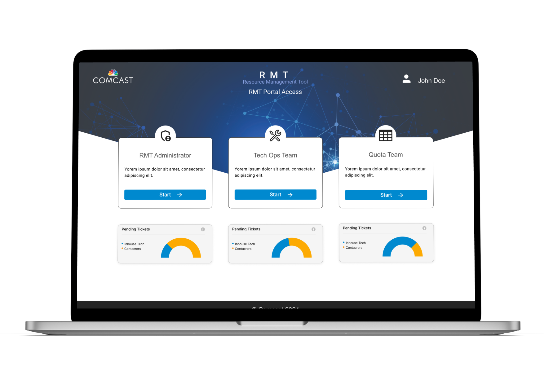
The Resource Management Tool (RMT) is a scheduling and ticketing application which manages over 10,000 field technicians. Primarily, it provides a comprehensive overview of Technical Operations in real-time. The Tech Ops team uses it to manage technician schedules, onboarding and dispatch more efficiently. I was responsible for redesigning the entire user interface and helping to transform a legacy Microsoft Access platform into a modern cloud based web application.
My Role
User Researcher
Information Architect
UX/UI Designer
Design Tools
HTML
UX Deliverables
Information Architecture
Low fidelity Interactive Prototype/Wireframe
High Fidelity Mockup Design
Design Concept Presentations
Design Problem & Solution
Design Problem
A key objective of the project was to leverage UX design best practices such as consistent navigation, meaningful visual hierarchy and layout while creating a design that adapts to various user needs and business requirements. Since the legacy application did not have a consistent UI design, one of the major challenges was understanding the various task flows and interactions. After several sessions of usability testing, certain interaction patterns emerged and I was able to design consistent UI elements to achieve user tasks.
Design Solution
Working collaboratively with the product and development teams, I created a modular user interface that provides multiple access levels depending on current user role. Visibility of the various interface components is configurable and adaptable to business needs.
For example, Tech Ops agents use the tool daily for Tech Profile updates or to check status of previous tickets. Agents need quick access to most recently updated tickets and also quick update for specific techs. The solution included a data table with sort and search features and update ticket page just two clicks from the landing page.
UI Design Before & After

- Technician name is displayed separate from the select form element, also highlighted to show visual hierarchy. Other relevant information, tech number and supervisor name also displayed.
- Tab style is updated and consistent with design system used through out the application
- Technician calendar design is improved, each item is in a component and grouped into a single unit applying proximity and similarity principles.

- Tree analysis with end users to determine optimal navigation structure.
- Designed a simple, consistent contextual navigational system.
Research
Working in an Agile environment posed some user research challenges, it was critical to adopt a “Lean UX” approach. As a result there was over between research. ideation and prototyping phases. The project team comprising of Product Owner, Project Manager, Developers, UX Designer and RMT Subject Matter Experts worked collaboratively from kick off to post launch.
Project Team Meetings
100+ hrs

The team had 3-4 hours of weekly meetings for over 4 months.
I also scheduled additional focused meetings with SMEs, for a deeper understanding of the workflows.
Meeting Documentation
200+ screenshots

RMT is a complex tool with dozens of screens and several variable modes. Reviewing the meeting recordings several times over to capture every possible use case and application state.
User Research
A deep understanding of the user is the main goal of the research phase. Since the product owners would also be using the tool, it was important to differentiate the various user roles. After several meetings with stakeholders including the product team and business analyst, the following roles were identified:
- RMT Administrator
- Quota Team Coordinator
- Tech Ops Agent
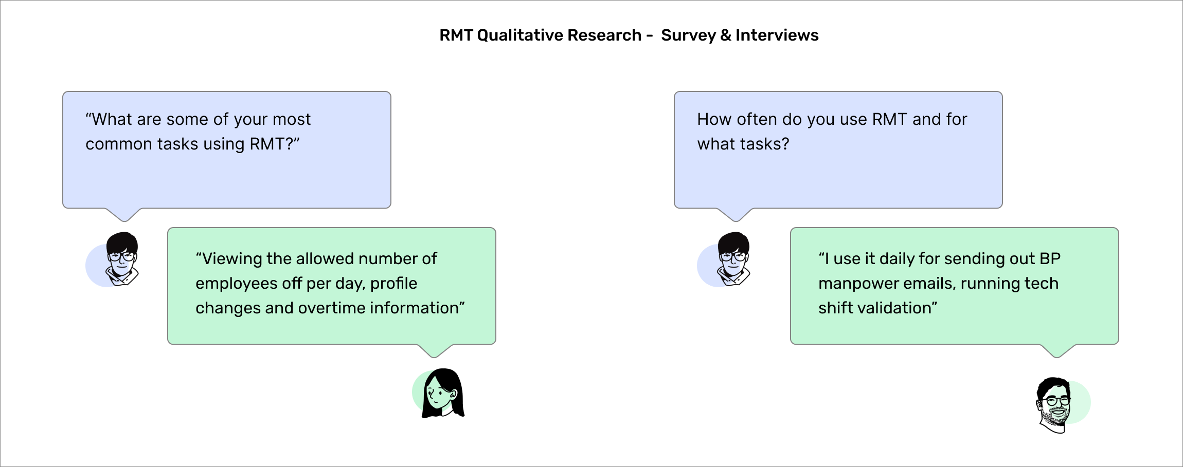
My research was mainly qualitative and included surveys and user interviews with employees in the Installation & Service team as well as Business Support & Analytics. A total of 6 employees were interviewed. Interviews were conducted via video calls and email surveys / questionnaires.
Research Findings
- RMT is used daily to perform very important routing and dispatch workflow tasks and for updating tech schedules
- The tool is used in conjunction with other applications and data is transferred automatically, however sometimes agents need to update data manually
- The user interface is highly dependent on the underlying database structure and not optimized for user tasks or needs
Personas
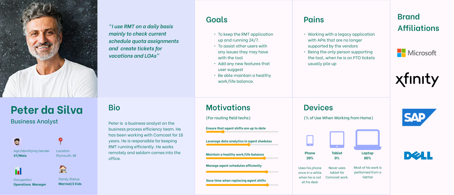
RMT Persona: Tech Ops Agent
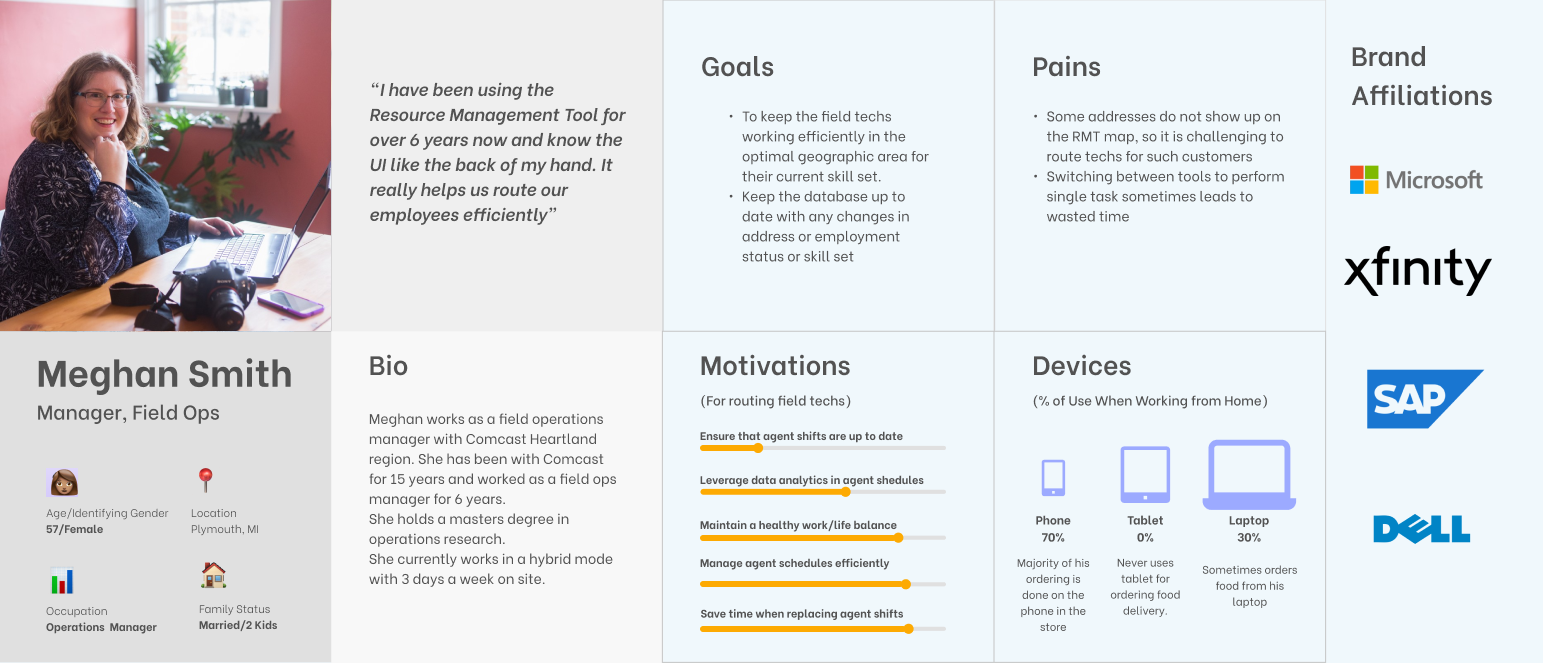
RMT Persona: Manager Field Ops
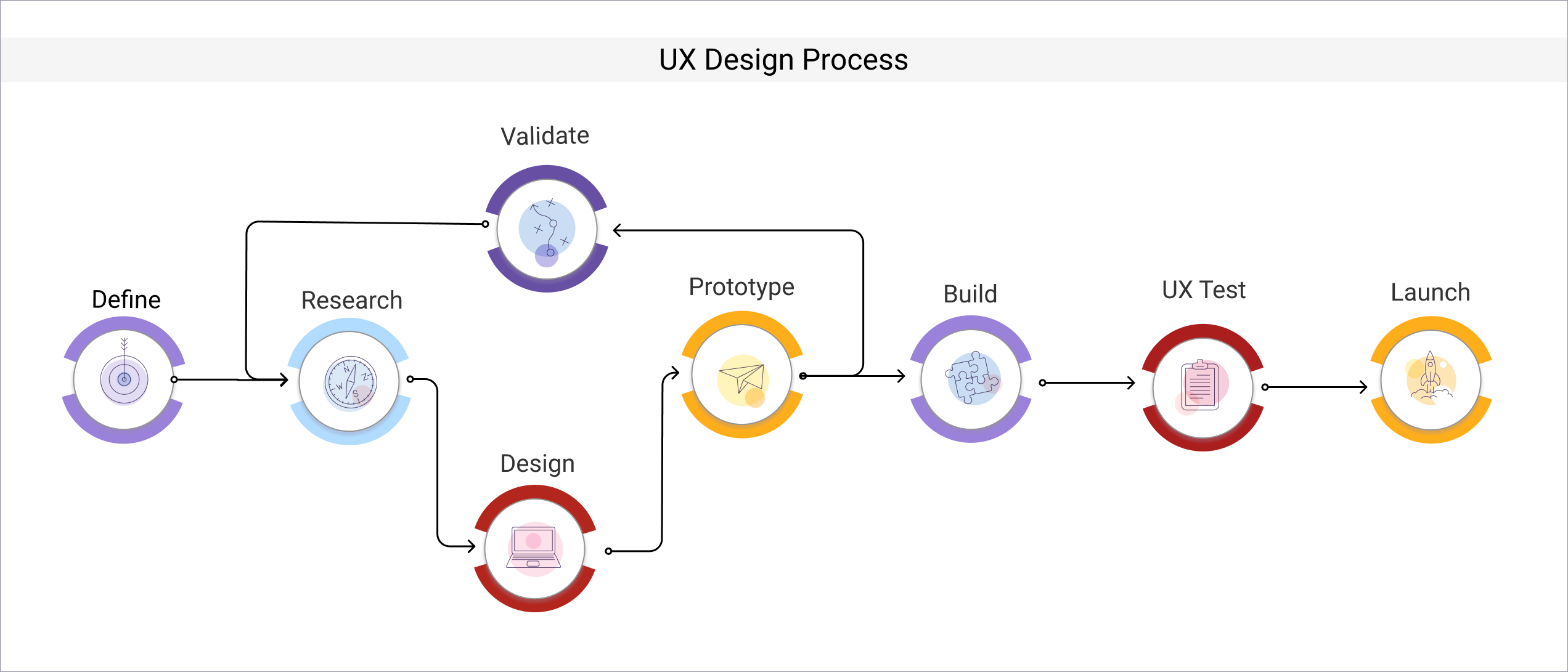
Ideation
User Flows
Creating user flows involved defining important tasks and workflows that users would perform while using RMT. Common tasks such as processing technician tickets, running tech shift validation reports were identified. At this point we realized that there was a relationship between user roles and tasks. Certain tasks like approving time off requests could only be performed by the Tech Ops role. On the other hand tasks like reviewing a ticket could be made by all roles.
 RMT Create Tech Update Ticket User Flows


User Journey Map
A typical user journey map for a Tech Ops agent making a profile update request. Starting from the beginning a new work shift, with email reviews. When the agent reads an urgent profile update request he immediately clicks the embedded link and logs into the tool. The user journey continues through the request processing steps until approval is granted and tickets is closed

Information Architecture
Based on the business requirements and user feedback, high level content categorization and taxonomies were identified. The task flows also helped in defining common entry and exit points as well as organizing content into related categories.
 RMT Quota Route Sheet


Initial Sketches & Concepts


Prototypes
Low Fidelity Wireframes & Prototype
After the information architecture was finalized, the next step involved translating the diagrams into low fidelity wireframes.
 RMT TechOps Deactivate Tech


Final UI Design
UI Design Kit
Before the final high fidelity mockup was designed, the visual exploration step included a style guide. This helped to create a consistent look and feel for the UI elements

High Fidelity UI Mockup
The wireframing step required several iterations due to user feedback. After the wireframes were accepted by the team, high fidelity UI mockups were designed
 RMT Admin Route Sheet


Results & Impact
Cost Savings
$1.7m
2021 OpEx Savings
Voluntary Time Off
$270k
OpEx Value
KPI/OKR
Reduce Truck Rolls
Tech Routing Efficiencies
Regional to Divisional Adoption
Lessons Learned
During the course of the project, we did not have a clearly defined UX documentation procedure. Since I was the principal designer, it is my responsibility to ensure that all UX design efforts are documented and stored in a central repository. A few months after the project was launched, I was made aware of Confluence, a documentation platform recently adopted by the team.
In the future all project artifacts, design assets will be stored in a dedicated Confluence Space.
Leave a Reply