
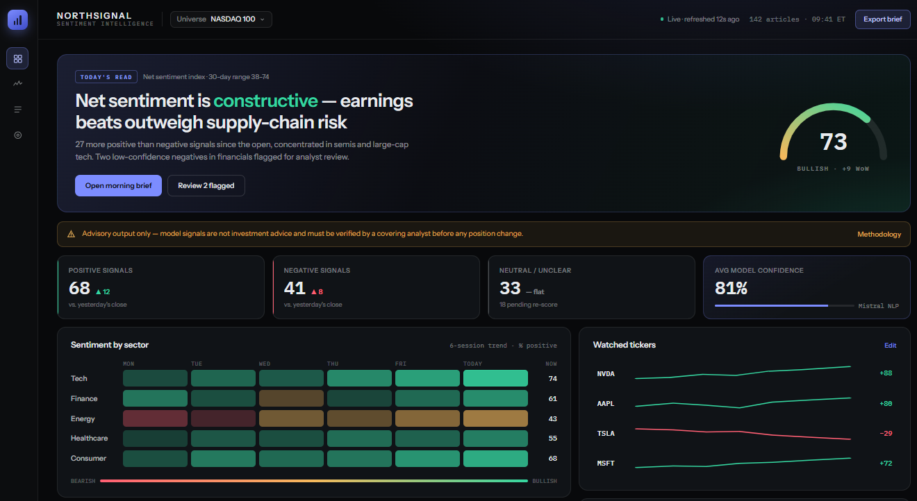
Project overview
- Company
- Portfour limited Co
- Product Owner
- Portfour limited Co
- Date
- 2026
My Role
UX/AI Design Lead
NLP Model Analyst
Prompt Engineer
Design Tools
 Claude (Code & Design)
 GitHub
 Google Colab
 Jupyter Notebook
UX/AI Deliverables
NLP Model
EDA and Model Evaluation Report
Interactive Prototype
UX Design Context
- Designing for AI-assisted financial decision-making.
How do you design an interface and user experience that makes a complex AI system trustworthy and intuitive to financial analysts? The core challenge is to design the tool so that it hits the sweet spot where financial analyst don’t ignore it or over-rely on it.
Business Context
- NorthSignal – Sentiment Intelligence
An investment services startup needs to accurately interpret the massive amount of financial news related to specific companies on NASDAQ. They decide to leverage the power of Artificial Intelligence and Natural Language Processing (NLP) to improve efficiency.

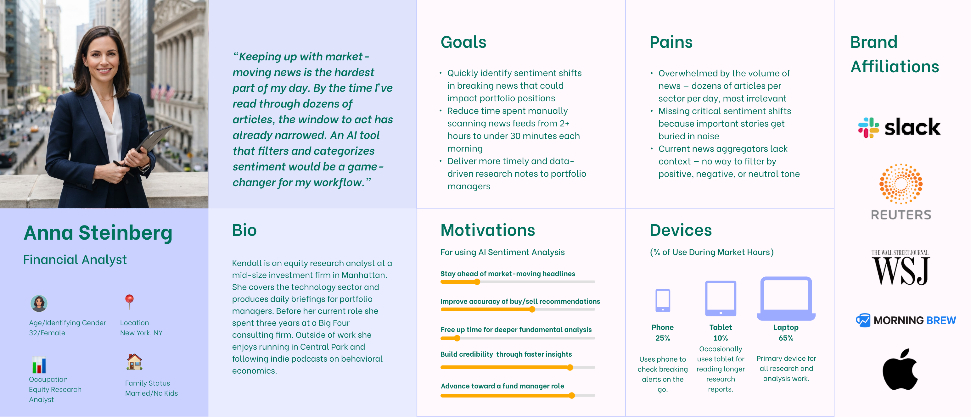
UX Persona
NLP Model Evaluation
- NLP Model Building & Evaluation
Any AI model is as good as its training data. I used the Financial PhraseBank dataset, with over 2,000 data items, and evaluated two models from HuggingFace.
- Mistral 7B instruct: a generative NLP model with 7 billion parameters
- ProsusAI/FinBERT: a classification model, purpose built for financial sentiment analysis
- Exploratory Data Analysis
Following Data Science best practices initial data analysis was done to ensure the data is clean and properly formatted for ML models. Source data included financial news and stock prices over a 4 month period (January – April 2019). Duplicate and missing value checks were performed
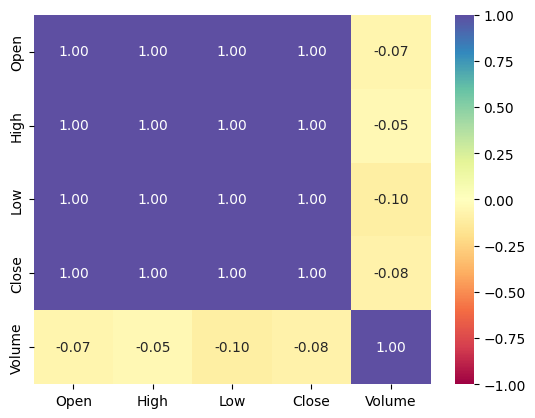
The heatmap shows that market open, close, low and high prices, have direct correlation
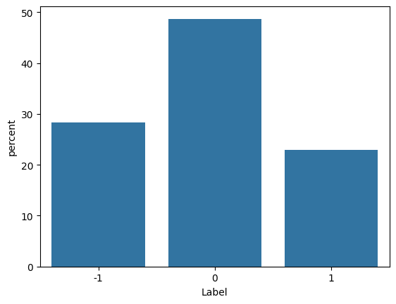
The news sentiment distribution below shows about 50% of the news is labeled neutral (0)
Model Evaluation Criterion
Model evaluation is normally performed using a confusion matrix to compare true/false positives and true/false negatives. In this case involving investment decisions, false positives (model predicts a bad investment as good) can have significant financial consequences. The goal is to minimize false positives by ranking model Precision with highest priority.
Final Model
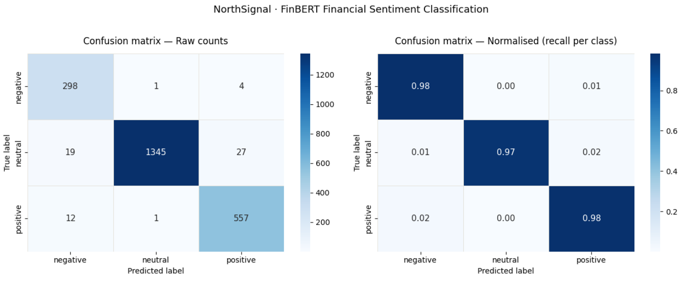
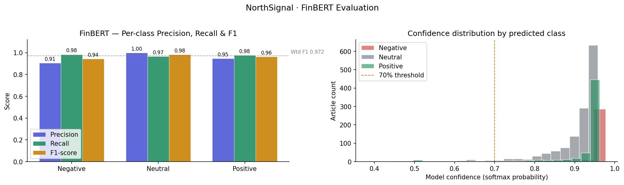
FinBERT performed better on all evaluation criteria: Precision, Accuracy, Recall and F1 scores
- Mistral – weighted F1
- 0.426
- FinBERT – weighted F1
- 0.976
Model evaluation heatmap (Confusion matrix) for FinBERT is shown below
Model confidence score for each sentiment class
Model Error Analysis
FinBERT generated a very low error rate: 2.34 %. An excerpt from the error report is shown below:
── Sample misclassified articles ───────────────────────────────

Error type : neutral → positive
Confidence : 0.687
Article    : STOCK EXCHANGE ANNOUNCEMENT 20 July 2006 1 ( 1 ) BASWARE SHARE SUBSCRIPTIONS WITH WARRANTS AND INCREASE IN SHARE CAPITAL A total of 119 850 shares have been subscribed with BasWare...

Error type : neutral → negative
Confidence : 0.941
Article    : The broad-based WIG index ended Thursday 's session 0.1 pct up at 65,003.34 pts , while the blue-chip WIG20 was 1.13 down at 3,687.15 pts ....

Error type : positive → negative
Confidence : 0.968
Article    : Unit costs for flight operations fell by 6.4 percent ....
UX-AI Design Challenges
The core UX challenge is designing for appropriate level of trust. Finding the balance between causing the analysts to ignore the tool completely and depending on it excessively without checking the tool’s responses.
- Human-in-the-loop
It is absolutely necessary to have human verification before any investment decisions are made. To achieve this the following design decisions were made:
- The “AI advisory mode” banner is persistent and not dismissible
- Model confidence indicator is included in each news item
- AI advisory banner

This banner follows a UX-AI design best practice to constantly remind users that AI can make mistakes. It can be found in all major public AI model interfaces – ChatGPT, Claude, Gemini etc. Even though users may see it everyday and get familiar enough to glance over it without a second thought, keeping it there all the time serves an important purpose and not just for legal or liability concerns
- Model confidence indicator
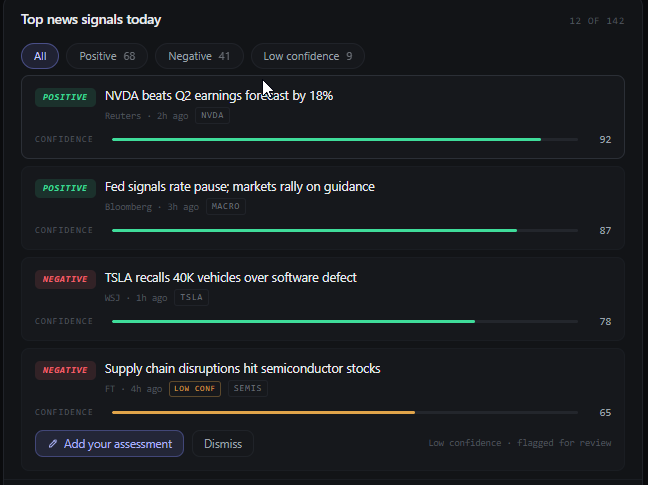
Each news item displays a color coded confidence indicator. Keeping accessibility in mind, a progress bar is used in addition to color, this ensures that color blind users can still use the indicator effectively
Dashboard Design
The dashboard includes four key components
- Sector-level gauges
- Sentiment trend with Spark lines
- Top News signals
- Analyst Assessment for Low Confidence Items
- Top News Signals
- with sentiment filter, confidence score, add assessment
Perhaps the hardest design decision wasn’t how to show the sentiment, rather it was figuring out how to show the model’s uncertainty without making the analysts ignore it. Each news item includes a confidence indicator, news source for reference. Low confidence news items also have the “Add your assessment” option, this is the “human-in-the-loop” feature. Analysts need to verify the news item and either confirm or change the sentiment.
- Sentiment trend with spark lines
- transforming data into insight
Data from the AI model’s output is transformed into meaningful insight through effective visualization. The choice of a spark line instead of several other options is critical and strategic.
Spark lines allow analysts to quickly identify trends, daily data in isolation obscure this insight. In addition the compressed view can be expanded for further analysis.
In the expanded view a stacked bar shows the article mix in detail, analysts can see percentage of each sentiment, not just the overall aggregate. This gives them a solid understanding
Finally the links to source articles provide evidence for the model’s conclusions. AI design best practice make the model’s supporting evidence one click away, not hidden and not cluttering up the interface.
- Sector level gauges
- market by sector visual summary
Investment analysts often need to process information very quickly. The sector level gauges provide a quick overview of the market by sector. This allows analysts to quickly spot potential changes in specific sectors without detailed analysis. If they spot something changing they can focus on that sector and investigate further.
The decision to use gauges for data visualization instead other types of charts like a heatmap or pie chart

- Analyst Assessment flow
- Low confidence items allow for human-in-the-loop
Sentiment reclassification has significant implications on analyst workflow and model improvement. This flow was designed to serve dual purpose – data collection for model improvement and correcting any errors in model classification output. A few key UX design decisions were involved in designing the inline override panel.
- Reclassification CTA
- Reclassification sentiment selectors
- Reclassification reason options
Reclassification CTA
An edit button was the initial idea, however it raises several issues. First it implies the analyst is fixing the dashboard, which could lower the trust level. Second it overlooks the second purpose of improving model performance. Reclassification without explaining why does not help the model improve.
Reclassification sentiment selectors
Including a “Neutral” option rather the binary positive/negative allows analysts to better capture ambiguous news items.
Reclassification reason options
These options provide deeper context for the analyst’s reclassification and also serve as data points for model retraining. For example “sarcasm/irony” tells the retrained model to look for linguistic patterns or figures of speech that it is currently misunderstanding. This is the very core of human-in-the-loop design. The analyst is not just fixing the model’s output but making it smarter in the future.
Outcomes
- Efficiency: On average, analysts spend up to 90 minutes each day reading the news. NorthSignal can cut that down to 20 minutes or less, by filtering out all the noise. Giving analysts a curated batch of news items to review. NorthSignal does not replace analysts’ judgement, rather it gives them more time to use it
- Design: NorthSignal does not simply show the model’s final output, it also shows the confidence score, resulting in more transparency. Analysts can map the 3 tier score (Low, Medium, High) to their workflow states: Act, Investigate, Queue. Furthermore the reclassification flow brings in human-in-the-loop approach and allows analysts improve retrained future models. This is the key difference between an AI tool that replaces a workflow and one that elevates it.
- AI strategy: NorthSignal shows that it is more appropriate to use artificial intelligence to handle volume rather than judgement. By showing the model’s uncertainty, and involving analysts in retraining, the model improves over time.
Choosing to make the model's uncertainty visible was the most important design decision. Lack of transparency in AI tools encourages users to stop thinking. In financial-decision making that is not simply bad UX design, it is a catastrophic risk.

Leave a Reply