Project overview
- Company
- State of Connecticut
- Product Owner
- State of Connecticut
- Date
- 2023
My Role
User Research
Information Architecture
Product Design
Design Tools
Figma
Miro
Adobe Photoshop
UX Deliverables
User Research
Competitive Analysis
Information Architecture
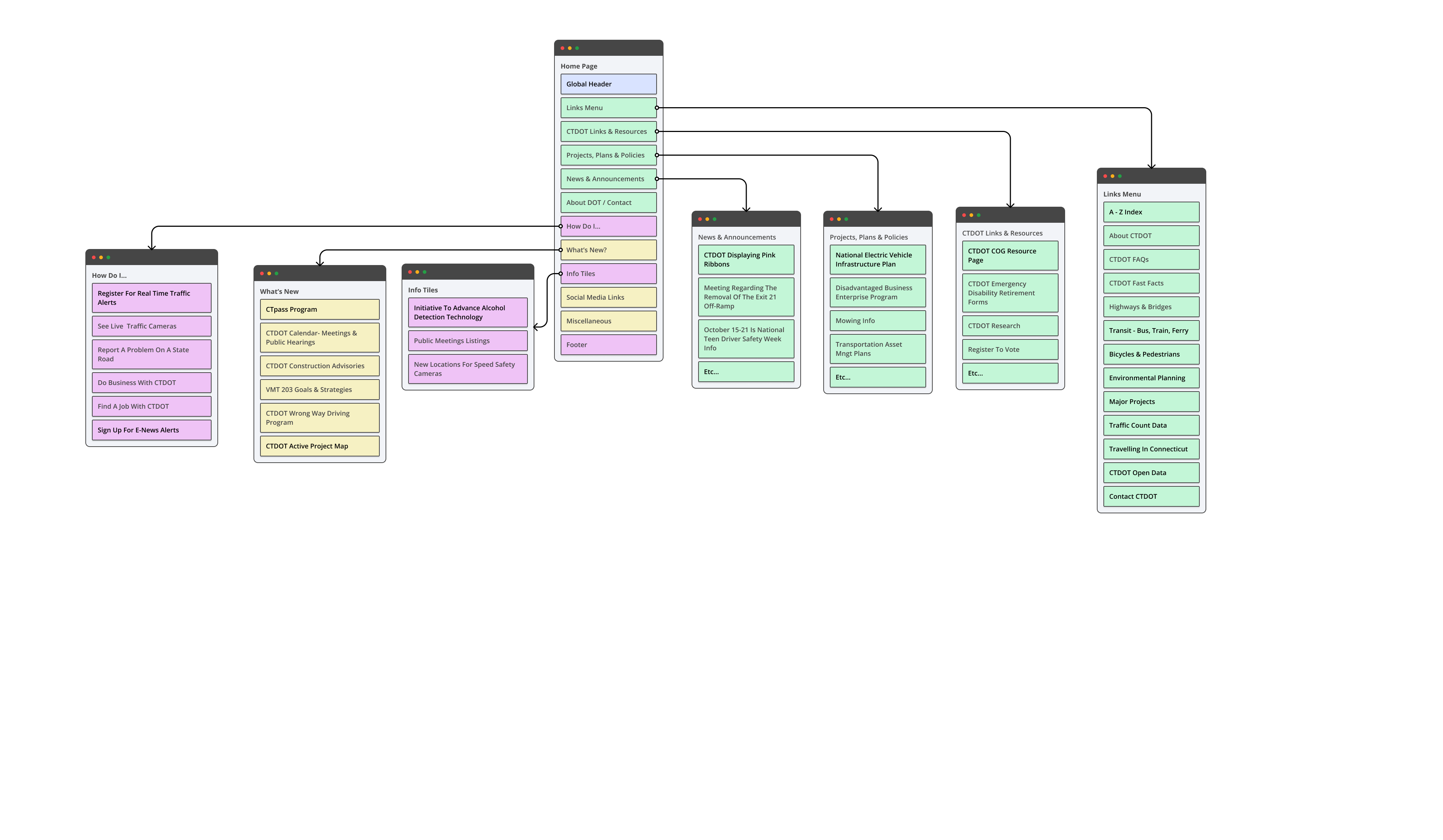
Site Map design
Low fidelity Wireframe
High Fidelity Mockup Design
Introduction
As part of the “Don’t wait in line, get online” campaign the State of Connecticut is looking to create a unified experience across all digital assets. This project involved redesigning the Connecticut Department of Transportation’s website.
The DOT is a large and important agency and manages services including traffic, highways, bridges and public transportation.
Design Problem
The current design of the of the DOT site is not meeting the current needs of citizens of Connecticut. Focusing on delivering services to users based on their intentions how do you redesign the user experience and website user interface?
Design Process
The design process started with secondary user research and UX audit of the current website
User Research
Identify the types of people who visit the CTDOT site, their interests and needs. Since this was a design challenge a lot of assumptions were made after doing the competitive analysis with other state DOTs.
Competitive Analysis
Competitive research and analysis is a crucial step when designing any public facing web site. It helps you understand the existing market for your service and also leads to better insights from user research. Another advantage is that it helps to uncover gaps in the competition’s services which can lead to developing profitable key differentiators.
The following State DOTs were reviewed:
- New York State DOT
- CalTrans
- GeorgiaDOT
- Texas DOT
Competitive Research Findings
To efficiently structure website content, it is crucial to identify the most sought-after information or services by users. Recognizing the popularity of specific content or services is key, particularly for information-rich websites where users must easily locate relevant information. Therefore, establishing a well-thought-out taxonomy is essential.
Ensuring consistency between navigation labels and page titles is vital. For instance, linking “Traveling in Connecticut” to “Travel resources” creates a cohesive user experience. Similarly, aligning categories like “Transit,” “Bus,” “Train,” and “Ferry” with corresponding labels such as “Public Transportation Links” enhances user comprehension.
The “How Do I?” section appears confusing due to the inclusion of various information categories. To improve clarity, it is advisable to categorize items like news alerts, job searches, and traffic alerts under their respective sections, enhancing user understanding and navigation.
Information Architecture
Creating a site map for the current Connecticut DOT site allowed me understand the strengths and weaknesses compared to the similar sites. It also helped in identifying the gaps in the site’s UX design. Consequently, I was able to determine which areas need improvement and design a solution that would better meet user needs.
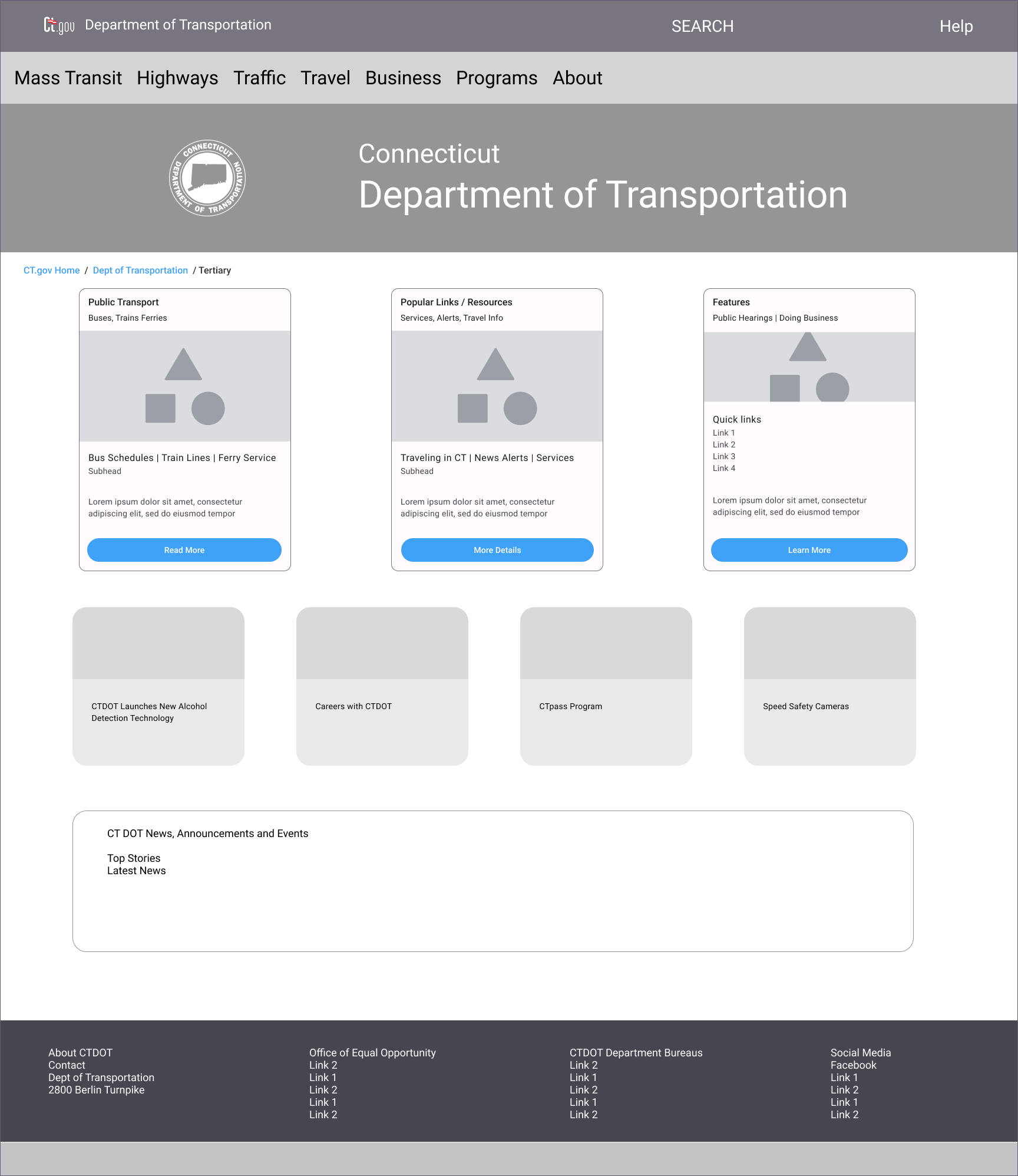
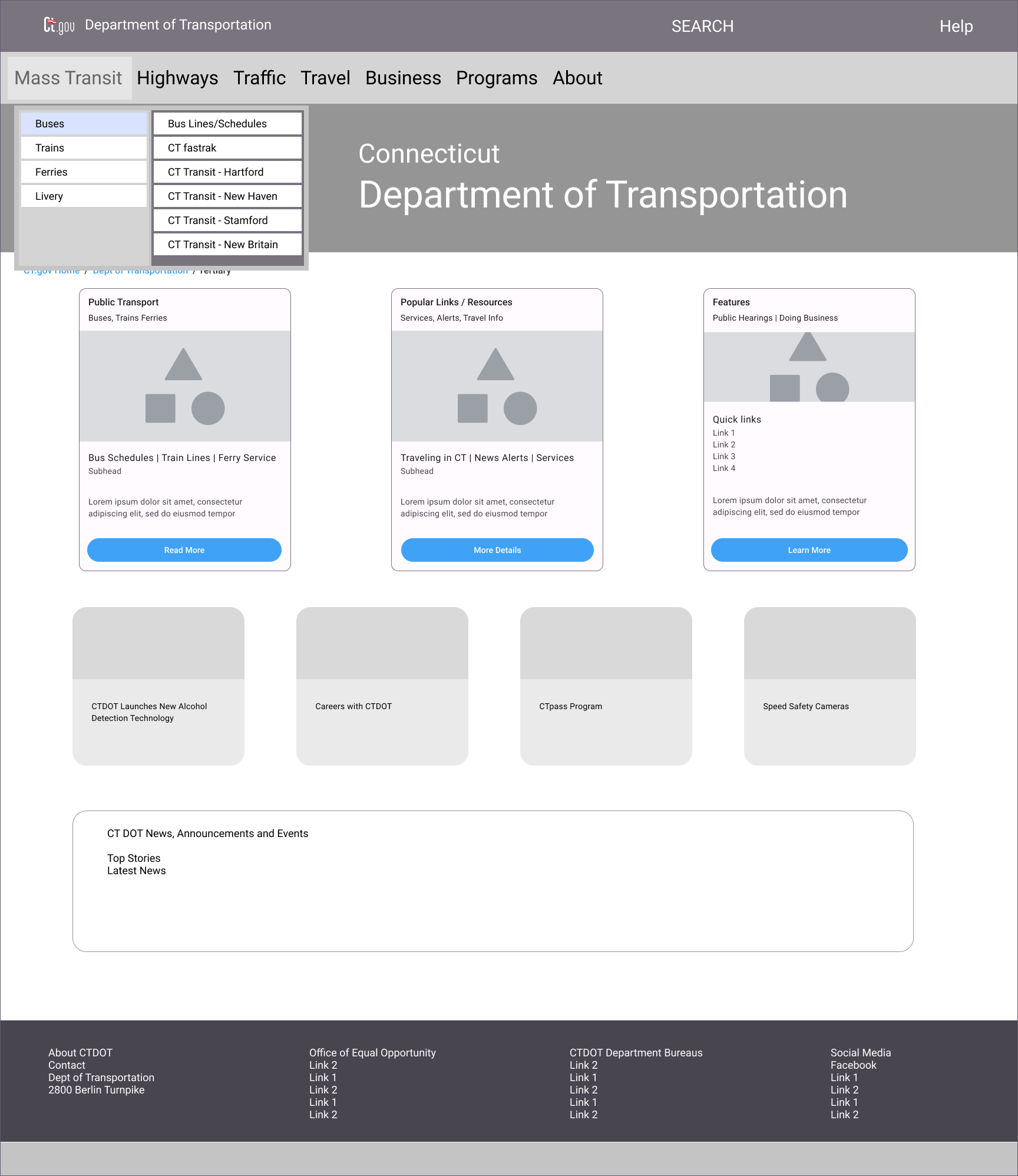
Low Fidelity Wireframes
After analyzing the information architecture and research findings, a low fidelity wireframe was designed
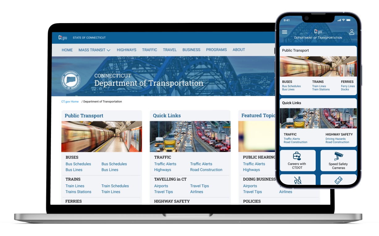
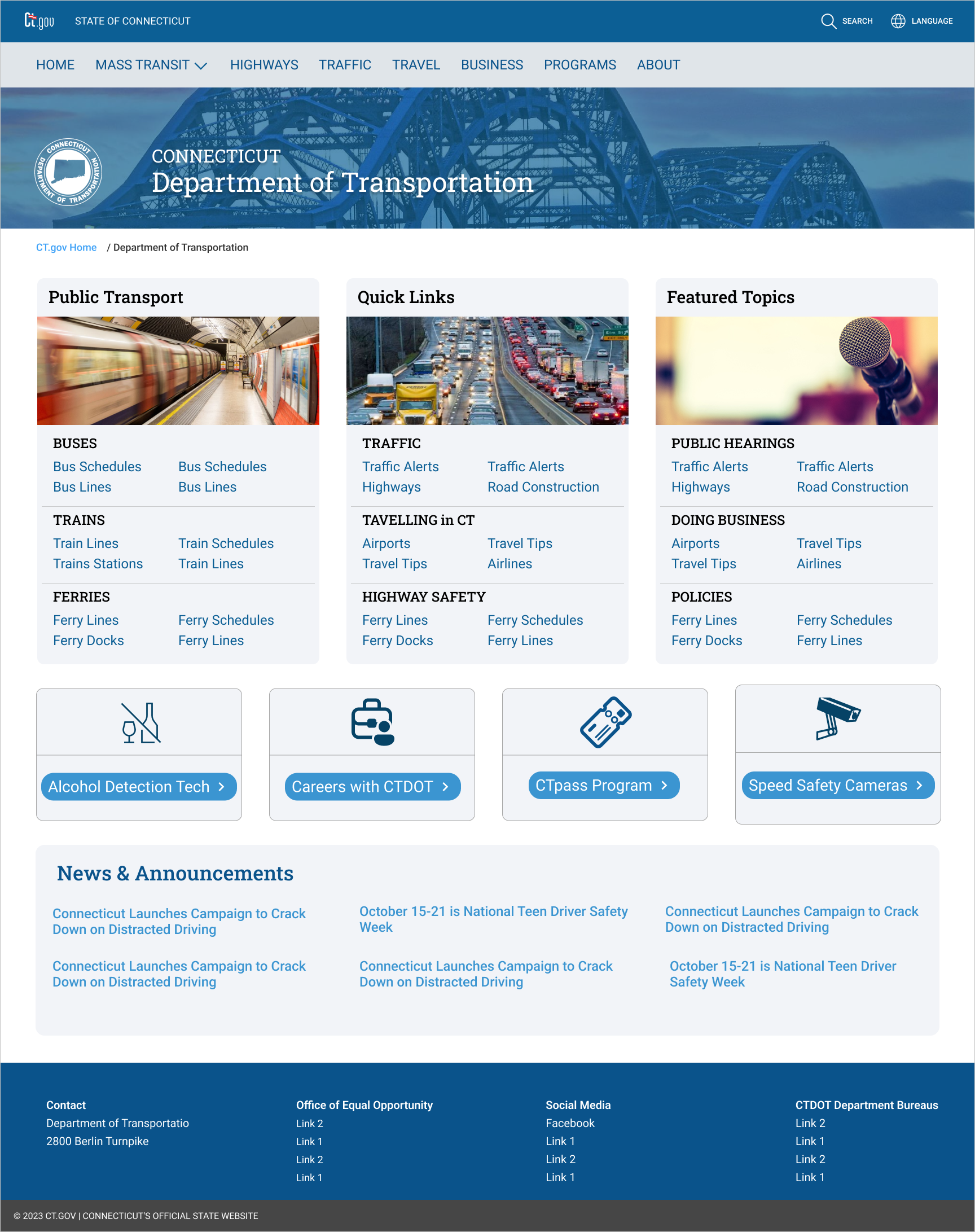
High Fidelity UI Mockup
A few sample UI mockup screen designs can be seen below. Expedia’s brand colors and design language have been adapted to create a familiar yet different user experience.
Credits and Sources
Photography
Figma – Unsplash plugin
Leave a Reply