Project overview
- Company
- Comcast
- Product Owner
- Central Division Facilities Team
- Date
- 2021
UI Design Overview
My Role
User Research
Information Architecture
User Flow design
Low Fidelity Wireframe design
Design Tools
HTML
UX Deliverables
Information Architecture
Site Map design
Low fidelity Interactive Prototype/Wireframe
UI and UX design
High Fidelity Mockup Design
Design Concept Presentations
Context
Towards the end of the COVID pandemic, in 2021, Comcast senior management initiated the return to office campaign. One of the goals was to improve the efficiency of the access card request process. The facilities department came up with their business requirements for an access request tool.
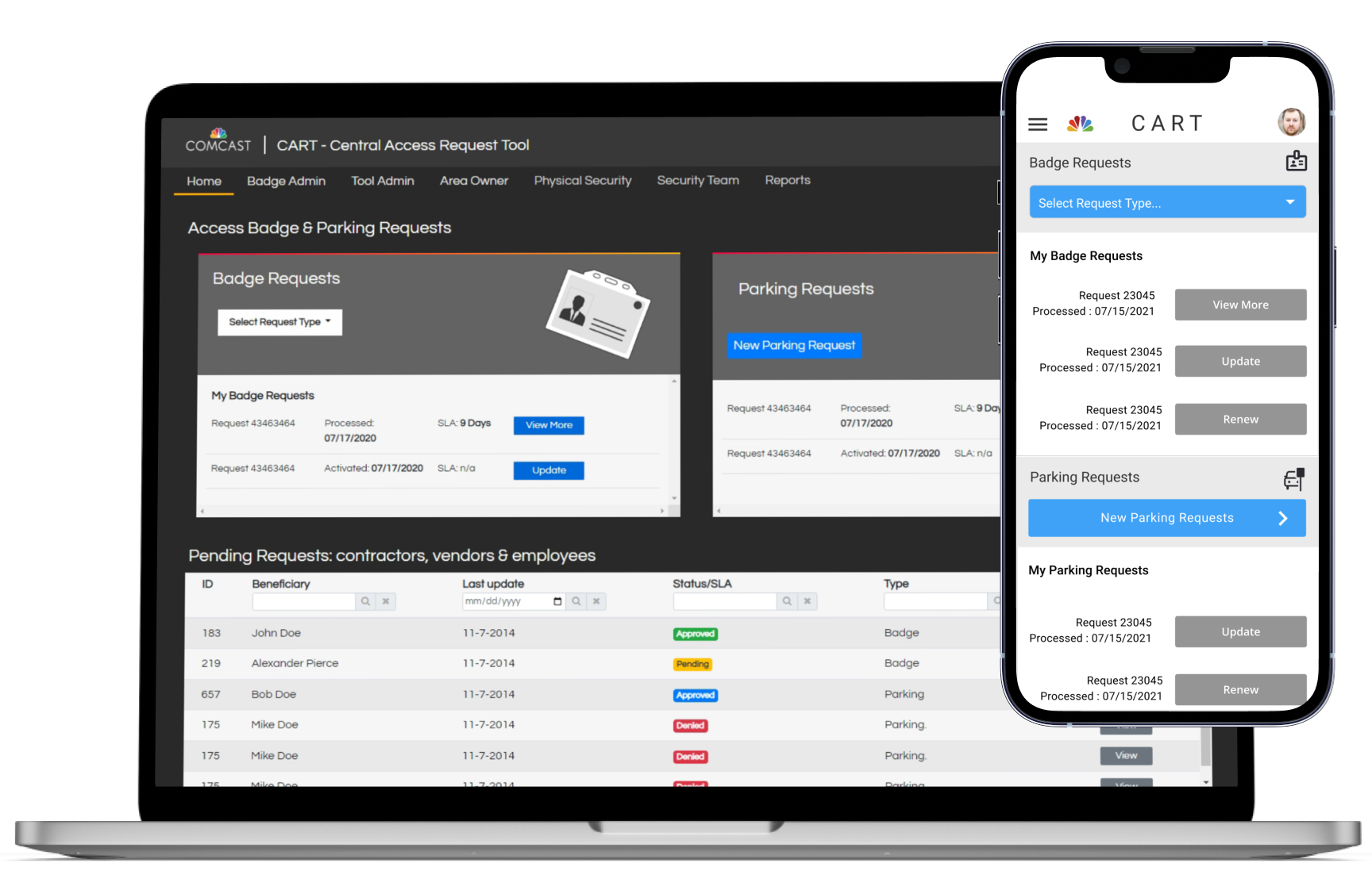
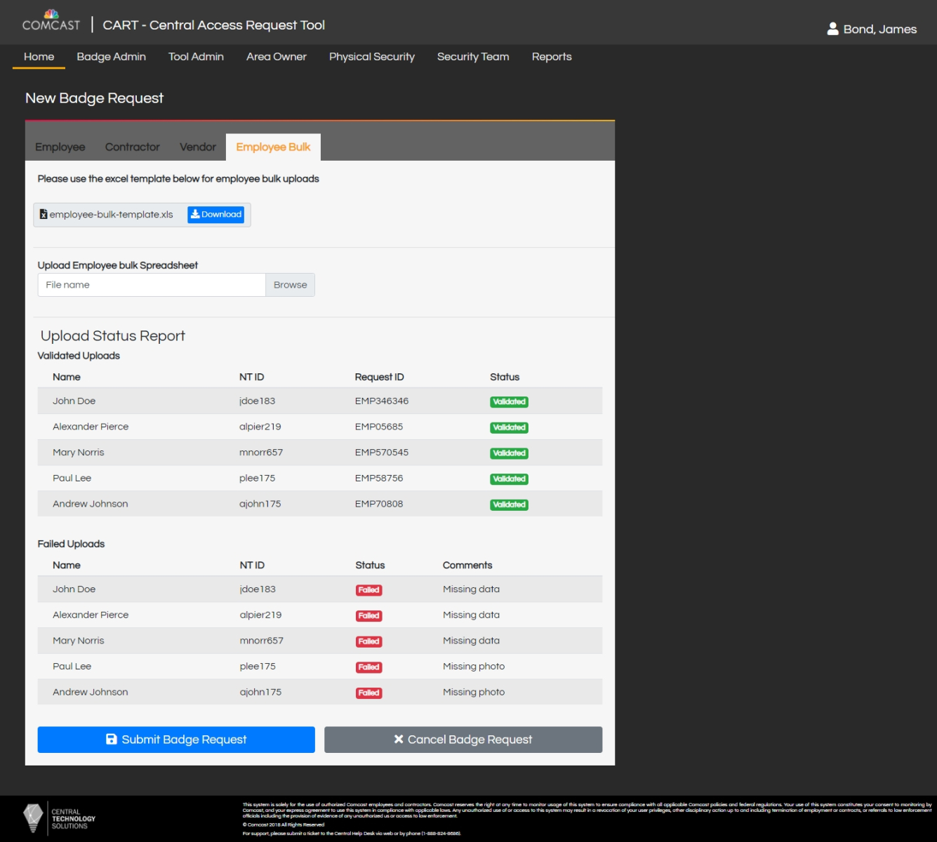
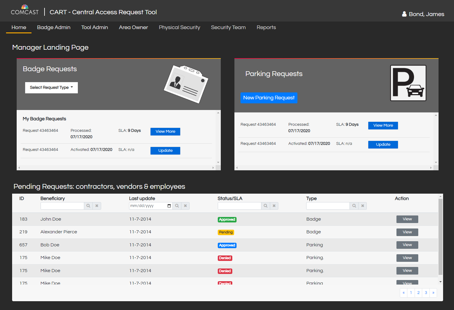
CART is a centralized access and security management tool for the Central Division in Comcast. The benefits include a single source of records to increase visibility on security related data. It will also provide audit and report features.
The tool’s design will provide a better user experience for employees making badge and parking requests. It will also support management’s security audit processes.
Design Problem
Transform a manual and confusing process into a streamlined one-stop-shop for access and parking requests. Also, design an intuitive, consistent user experience and simple workflow for employees ranging from VPs to Managers and Customer Support Agents.
Design Solution

Before
The card request process was like going through a maze without a map. The process was not well documented, inefficient and quite frustrating. Some of the steps included:
- Find the Badge admin’s contact info
- Send an email to find out access badge request requirements
- Reply from the badge admin
- Gather required documents and send via email
- Receive approval and shipment details via email
- Acknowledge card delivery
After
The long confusing process is streamlined through CART
- Logon to CART and fill request form
- Manage entire process through CART
Design Process
Weekly Team Meetings

Weekly sync meetings were part of an iterative, design thinking approach that involved all stakeholders including product owners and software developers. We discussed business and technical requirements as well as end user needs.
Pre-Launch Awareness

Collaborated with the Internal Communications team to develop training materials and documentation.
User Research
The design process starts with the goal of understanding the user. In this project the product owners would also be using the tool, so it was important to differentiate the various user roles. The following roles were identified:
- Employee
- Manager
- Contractor
- Point of Contact
- Security Auditor
- Badge Admin
- Area Owner
My research included surveys and user interviews with employees in HR and Facilities/Security departments. A total of 5 employees were interviewed. Interviews were conducted via video calls and the surveys by sending questionnaires via email.
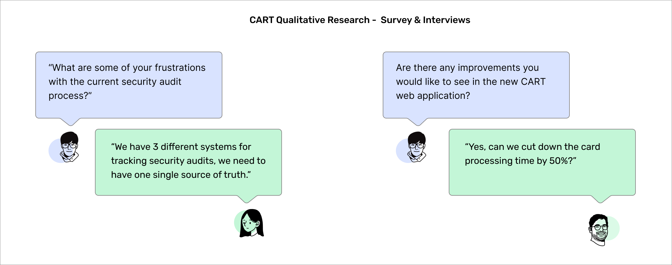
Research Findings
- Users were often frustrated with the inability to track the current status of badge or parking requests
- Badge requests were often sent with photos that don’t comply with regulations or without photos at all
- Request sometimes included incorrect shipping or access request location addresses
- Existing process (using email) is unreliable and inefficient
Personas
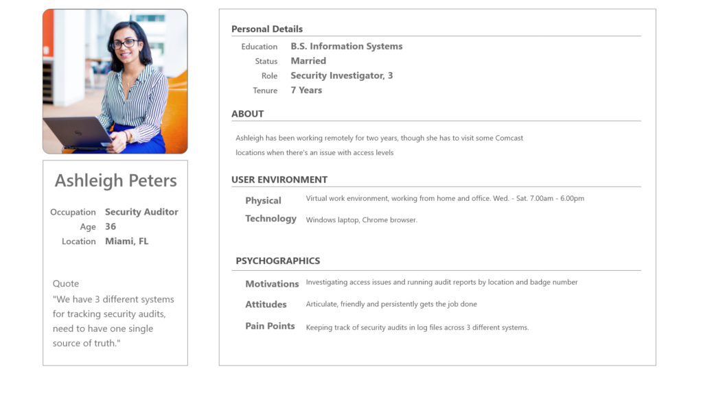
CART Persona: Security Auditor
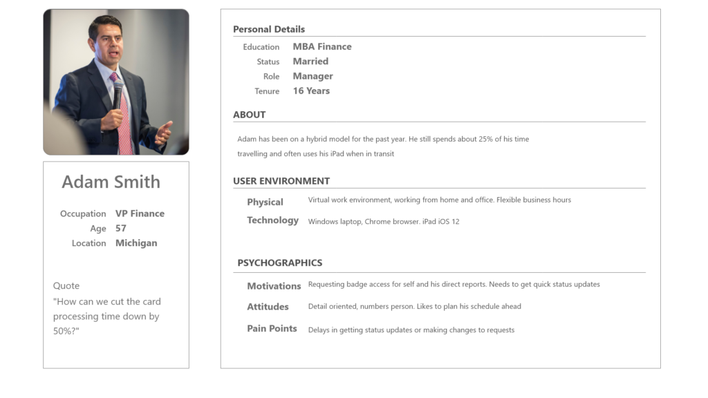
CART Persona: VP Finance
Ideation
User Journey Map
A typical user journey map for a manager requesting a new access card for a new hire, would start from the onboarding process all the way till when the card is handed over to the new hire. There are several opportunities to improve the overall experience for both the manager and the new hire.

User Flows
Creating user flows involved defining important tasks and workflows that users would perform while using CART. Common tasks such as requesting a new access card, adding or removing access levels on a card and request for parking access were identified. At this point we realized that there was a relationship between user roles and tasks. Certain tasks like reviewing card access requests could only be performed by the badge admin role. On the other hand tasks like renewing a card request could be made by all roles.
Information Architecture
Based on the business requirements and user feedback, high level content categorization and taxonomies were identified. The task flows also helped in defining common entry and exit points as well as organizing content into related categories.

Prototypes
Low Fidelity Wireframes & Prototype
After the information architecture was finalized, the next step involved translating the diagrams into low fidelity wireframes.

Final UI Design
High Fidelity UI Design
UI Design Kit
Before the final high fidelity mockup was designed, the visual exploration step included a style guide. This helped to create a consistent look and feel for the UI elements

High Fidelity UI Mockup
The wireframing step required several iterations due to user feedback. After the wireframes were accepted by the team, high fidelity UI mockups were designed

Impact & Results
At product launch, about 16,000 Comcast employees and contractors had access to the CART portal.
Card request processing time was reduced to 48 hours or less from 3 – 5 business days prior.
Employees can get a direct link to CART portal by searching the internal Workday portal.
One important lesson learned is to change my design process and still create high fidelity UI mockups in a design tool (like Figma) instead of going direct from wireframe to HTML/CSS templates.
Leave a Reply